Fandango and Facebook Just Violated My Privacy

I just bought tickets from Fandango to see a movie with my girlfriend later this week. On the order confirmation screen, I noticed a Facebook-looking message peek its head and then quickly disappear. I whipped-out one of my clever hacking tools and made it appear again:

Fandango Publishing Facebook Story

Yes, I see the “No Thanks” link, but the whole dialog was visible for no more than two seconds. Definitely not enough time for me to read it, process what was going on, and act appropriately.

Instead of defaulting to publishing a story in my Facebook profile, Fandango should default to asking me if it can do such a thing and wait for an explicit confirmation either way. After confirming, then maybe it could play this trick again the next time I buy a ticket without me wondering what just happened.

I’m afraid there are going to be more grievous misuses to come.

Update: this new Facebook feature has been getting a lot of press and backlash. So much so that Facebook has now changed the design from opt-out to opt-in…sort of. See my Google Reader Shared Items (via the right-hand navigation) to follow the story.

Controlled Vocabulary on a Budget

I called a DSL provider recently to cancel a 30-day trial. The first action the system demanded of me was to enter my “ten digit account number.” I frantically started looking for my shipping statement to see if it had my account number on it. It didn’t. The automated voice told me I hadn’t entered my account number yet and asked me for it again–time was ticking. I darted for my filing cabinet in search of my last phone bill; maybe they used the same account number since they were both provided by the same company. But, no, that couldn’t be it; my telephone account number was longer than ten digits. Then it dawned on me, the system was asking for my plain old phone number. I entered it, and the system recognized me.

Why didn’t it just ask me for my phone number in the first place?

Usability engineers promote the use of controlled vocabularies–consistent naming of items within products and services so that users quickly recognize the content being referenced. If there are two or more ways to name something, content authors should pick an authoritative descriptor and stick with it. Doing otherwise confuses readers and users. The goal is recognizable terms that lead to quick formation of concepts.

Several information architecture books cover the topic. My favorites are Information Architecture by Christina Wodtke, Hot Text, and Web Bloopers. All three suggest developing lexicons for site authors to use as the de-facto list of approved descriptors. Use of competing terms is prohibited.

Developing a lexicon upfront can be time-consuming, largely because you have to guess what terms will be necessary. Second, it’s an expensive process because you have to decide which terms win among the competitors. There are three ways to make the construction of a controlled vocabulary inexpensive and simple:

  1. Use a wiki or something else that doesn’t involve a lot of administrative overhead to store and disseminate the list of terms and the synonyms that lost the naming war.
  2. Debate and add words when authors and editors need to use them. This comes from a programming paradigm called lazy-loading. Don’t do the heavy-lifting unless or until you absolutely have to. You can experiment with letting authors decide which terms win when concepts are first encountered or having authors get help from the senior editor who is responsible for defining the appropriate lexicon. Obviously, whoever is making the decision needs to be informed and logical. Experiment until you identify the method that works best for your team.
  3. Save intra- and interpersonal debate time by using authoritative sources. Use websites on the topic or pull out your old college textbooks to get the wording right. Minimize the amount of time you spend determining which words your team will be using.

So that I can be as lazy and cheap as possible, and yet construct the appropriate lexicons for what I develop, I simply use Wikipedia whenever I can. The Wikipedia community is doing an excellent job creating a controlled vocabulary in a methodical way.

It’s okay to be lazy and cheap if you arrive at the right conclusion. It’s smarter than brute force.

(Speaking of laziness, the system could have just used Caller ID to identify me. But then I wouldn’t have anything to write about today.)

Closed-Ended Feedback

One of eBay’s strengths is its Feedback Forum where users are able to give open and honest feedback to each other after transactions are completed. The feedback results are open to all who want to view them. Users can discern whether or not they should buy from or sell to others based on prior feedback from the community. It is recorded using a score metric which can be set to “positive,” “neutral,” or “negative.” As well, feedback includes an open-ended text entry so that users can articulate specifics behind their score selection.

eBay assumes that a user is inherently neutral–that is, he is not good or evil. His lifetime Feedback Score starts off at zero (0). Whenever he receives a positive feedback post, his score increases by one; when he receives a neutral feedback post, it remains unchanged; and when he receives a negative feedback post, it decreases by one. All the while, a Positive Feedback percentage is calculated–much like a test grade in school.

eBay Feedback Profile

The beauty behind the eBay feedback model is its ability to convey whether or not a user can be trusted and also to what degree the entire community agrees in that trust. All things equal, if given a choice to purchase from a user with a Feedback Score of 2 or another of 157, most will choose to buy from the latter. The only problem with the Feedback Score display is the star graphic, which is somehow tied to it. I have been using eBay for almost a decade and its variations still mean nothing to me. It only adds noise.

The more serious flaw is the open-ended text feedback. Users have to manually skim over textual entries to get a feel for why someone has been given a particular score. Many entries add no or little value to the scores they describe. When every seller and buyer on eBay has “A+++++++++++++!!!!” entries, the playing field is leveled inappropriately. Good textual feedback typically falls in one of four categories: customer service, promptness of delivery, quality of good sold, and whether the purchaser would buy from him again.

eBay Positive Comments

If the textual responses were closed-ended instead, the feedback system could provide a clearer picture into why a user is getting the Feedback Score he is getting by calculating totals in each category. For example, this particular user had a history of sending imitation products. Most users still gave positive feedback because everything else was stellar, including situations where products were returned. If the quality of good sold category had a low score, those only interested in genuine products would steer away from this seller. Feedback would be specifically aggregated and useful.

Another benefit to closed-ended feedback is the prevention of flame wars, where users participate in mutual verbal attacks on character. Flame wars are subjectively blind and often heated by emotion rather than reason.

eBay Negative Comment

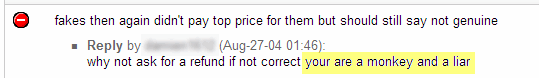
They divide communities, and make them unappealing to outsiders. Closed-ended feedback options avoid flame wars by keeping discussions objective.

Good metrics are devoid of emotion, and good metrics result in better decisions.

Helvetica and Software

I saw the documentary Helvetica Sunday night at AFI SILVERDOCS 2007. You have to see it. (Screenings are sparse and they have been selling out, so you might have to wait until October when the DVD comes out.)

Helvetica and its director

My friend Matt pointed out the fact that there were three groups of designers interviewed in the film: those of the modern design camp who saw the typeface’s birth in 1957 and love it to this day; those of the grunge design camp who didn’t like structure in the late 60s and 70s and hate it for its lack of emotion; and cutting-edge designers who love it and are bringing the design community back to it.

This contrast between camps becomes clear in the middle of the film when the interviewer asks designers why they like or dislike the typeface. Eric Spiekermann (of the modern design camp) summarizes the beauty of it when he states that Helvetica is a perfect balance between foreground and background–it does not distract the reader from the content of the message that is being communicated. Soon afterwards, David Carson (of the grunge design camp) explains that he, and other grunge designers by extension, believes that graphic design should be the expression of the artist’s feelings as he reads the content. Carson went on to illustrate through a personal experience. At one point in his career, he published an entire article in ITC Zapf Dingbats because he thought the article was dry and boring, rendering it unreadable.

Do you see what’s happening here? Grunge designers are forcing their personal impressions upon their audiences. I have no problem with this technique in art–art is often supposed to express an artist’s subjectivity and invoke a similar reaction in the audience; however, when presenting text, especially text written by another, designer expressiveness distracts. Readers are drawn to the way a chunk of text looks rather than how it reads. They are impressed but not convinced.

As I was watching this dichotomy unfold, I realized that this same mistake happens in software design. Developers can create subjectively “cool” functionality or user interface components and then force them on their users–not realizing that they are distracting users from the real reason they are using the software in the first place: to manage data. Unless users are trying to be wowed (i.e. videogames), developer expression is going to sidetrack or confuse users at best. This is why there are detailed user interface standards, guidelines, and best practices, and this is why software engineers and user interface designers should follow them.

Don’t try to be an artist unless you’re creating art.