My design life has been altered by three really good books:
- Donald Norman’s The Design of Everyday Things
- Edward Tufte’s Visual Explanations
- Steve Krug’s Don’t Make Me Think
After reading them, I can’t help but regularly see how I might go about fixing broken designs or simply improving ones that already work.
Last night was no exception.
Exhibit A: The Unusable Trash Can
While looking for a place to discard the remains of my dinner, I passed a row of recycling bins twice. Patrick, being a more intelligent individual, actually read the print on the recycling bins and noticed that one was really a trash can:
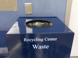
I’m all for reading and intelligent thinking, but whoever designed this fleet of waste bins could have done two things to aid their usability:
- Use a different color. Gestalt psychology teaches us that our brains tend to be holistic. When we see things that look the same, we at first believe they actually are the same–or at worst highly similar. I saw three blue bins and assumed all three were for recycling. I was wrong.
- Remove the conflicting text. I don’t know about yours, but my mind juxtaposes recycling and waste. (I think it’s because of all the positive “marketing” I’ve heard over the years about the benefits of recycling over simply throwing things in the trash.) I read “recycling” and stopped reading because I wasn’t looking for a recycling bin; I was looking for a trash can. It was right there in front of me.
Exhibit B: The Red Line
Patrick and I had two options as to which Metro station we wanted to start our trip from. He picked Grosvener-Strathmore over White Flint because he knew that more trains visited Grosvener and that we would be on our way quicker if it was our starting point.
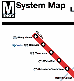
Both stations are on the Red Line and no other lines intersect Grosvener. So why and how can more trains visit it? Naturally, demand for the Metro increases the closer you get to the heart of DC, and they can handle this demand by allowing for trains to reverse direction at this particular station.
How are ignorant people like me supposed to know this helpful information? As I was asking myself this question, my mind subconsciously jumped to Minard’s Napoleon’s March and thought it would be nice if the thickness of the Metro lines on signs and printed material was relative to the frequency of train visits. In short, a thin line would mean few train visits and a thick one would mean more.
Obviously, this idea breaks down if the train schedule is dynamic (which it isn’t) or if a train breaks down on the tracks blocking traffic, which, unfortunately, my sister can attest to. However, under normal conditions, it reflects reality and would probably prove useful as people plan their trips without having to inspect a daunting, six-page train schedule table.
Although neither thoughts are mind-blowing, they struck me as nice ones to reflect on and share.
(See Patrick’s post on Subway Maps and Scope Creep.)

I think this could be done easily. It wouldn’t have to be precise; you would just need to know that more trains tend to run after a certain point on the station.
When I lived in Olney, I came up against the same thing–the cut off there is the Silver Spring station for more trains.
Obviously, this idea breaks down if the train schedule is dynamic (which it isn’t) or if a train breaks down on the tracks blocking traffic, which, unfortunately, my sister can attest to.
While the metro schedule isn’t dynamic it does change. During “peak hours” metro runs more and longer trains then it does during off hours. And it’s only during these peek times that some more metro trains stop at Grosvener. Now the interesting thing is that Metro’s PDF map and all of the in-car/station maps have a call out box that shows that trains stop at Grosvener during rush hour but for some reason they didn’t add that into the clickable map.
As for the train breakdown: unlike New York and many other systems for cost reasons Metro wasn’t built with a express track. And because of this there is no way (now or in the foreseeable future) to ever a) decrease the time between stations, b) run more trains at rush hour, or c) bypass a broke/out of service train. This more than anything (in my opinion) is what’s going to hold metro down in the future.
I’m just hoping that Metro gets funding for the Farragut and Chinatown/Metro Center tunnels.
Brando and Andrew —
If we take Brando’s point that the map wouldn’t have to be precise and Andrew’s point that there is such a thing as peak and off-peak schedules, I think we can construct a workable solution.
The solution would be to use thickness as previously described to indicate train frequency during the off-peak schedule. Now for the peak schedule: since train run lengths increase during peak hours, we can lengthen the segments of thickness out toward the end of the train lines using the same color but at a higher luminosity. This would be done without overlaying the thinner segment already drawn in the base luminosity for the off-peak schedule.
I crafted a rework of the end of the red line to show what I am trying to describe. (You can mouse over the image link and this link to the original image to see the difference.) Granted, this demonstration doesn’t show a thick off-peak segment closer towards DC, but I think it demonstrates what Grosvener would look like using color as another dimension to the map.
Any additional thoughts or critique?